MANHATTAN PRESS
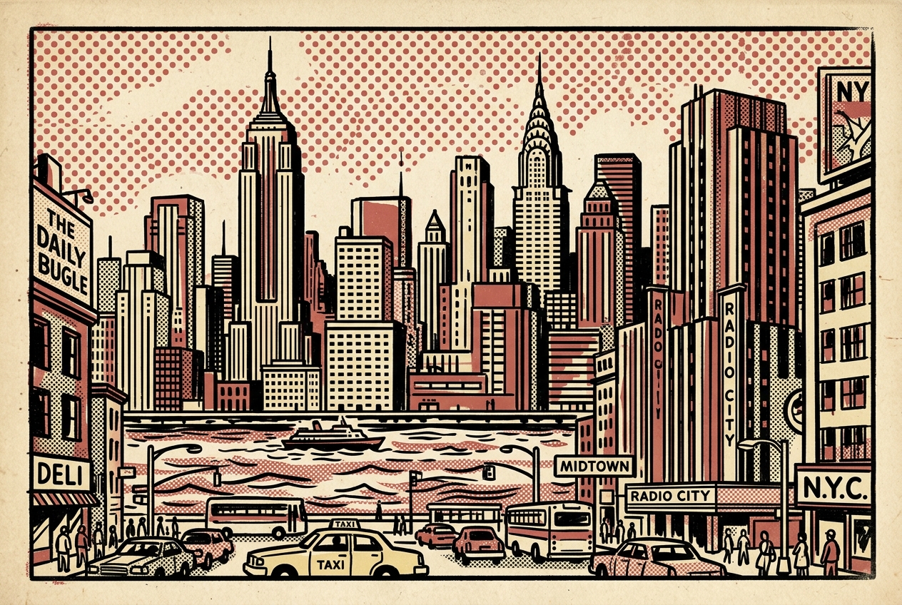
A bold, graphic-novel inspired interpretation of the Manhattan skyline. Utilizing vintage lithographic inks to capture the exuberant energy of commercial printing combined with architectural discipline.
Mid-century New York Pop Art meets modern frontend engineering. Heavy line weights, flat matte surfaces, and a rigid modular grid designed for digital solutions with physical permanence.


A bold, graphic-novel inspired interpretation of the Manhattan skyline. Utilizing vintage lithographic inks to capture the exuberant energy of commercial printing combined with architectural discipline.

A retro-futuristic comic illustration exploring the intersection of creative code and mid-century printing processes. Designed as a tribute to vintage terminal systems and the process of digital craftsmanship.

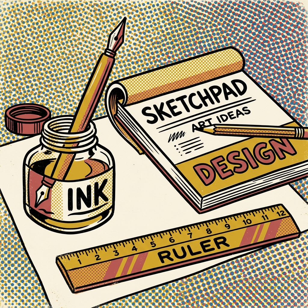
A sharp, orthogonal depiction of the essential designer toolkit. Rejects digital gradients and shadows in favor of bold ink lines, high-contrast geometry, and pure tactile layout structure.
We design systems, print graphics, and program responsive code. Everything is bounded by heavy line weights and architectural discipline.
Creating high-contrast, structural brand marks, custom logotypes, and complete brand design guidelines built on rigid geometric grids.
Programming responsive Next.js apps with custom design tokens, modern layout states, CSS scroller colors, container queries, and clean structures.